Are Bezel-less The Way To Go?
The technological industry for the past few years has been obsessed with shrinking bezels for more screen real estate. While it is a very welcomed move when bezels were the size of the Atlantic Ocean, now it looks as if the manufacturers are shrinking more than it has to.
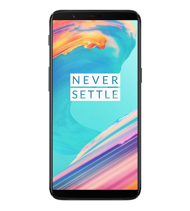
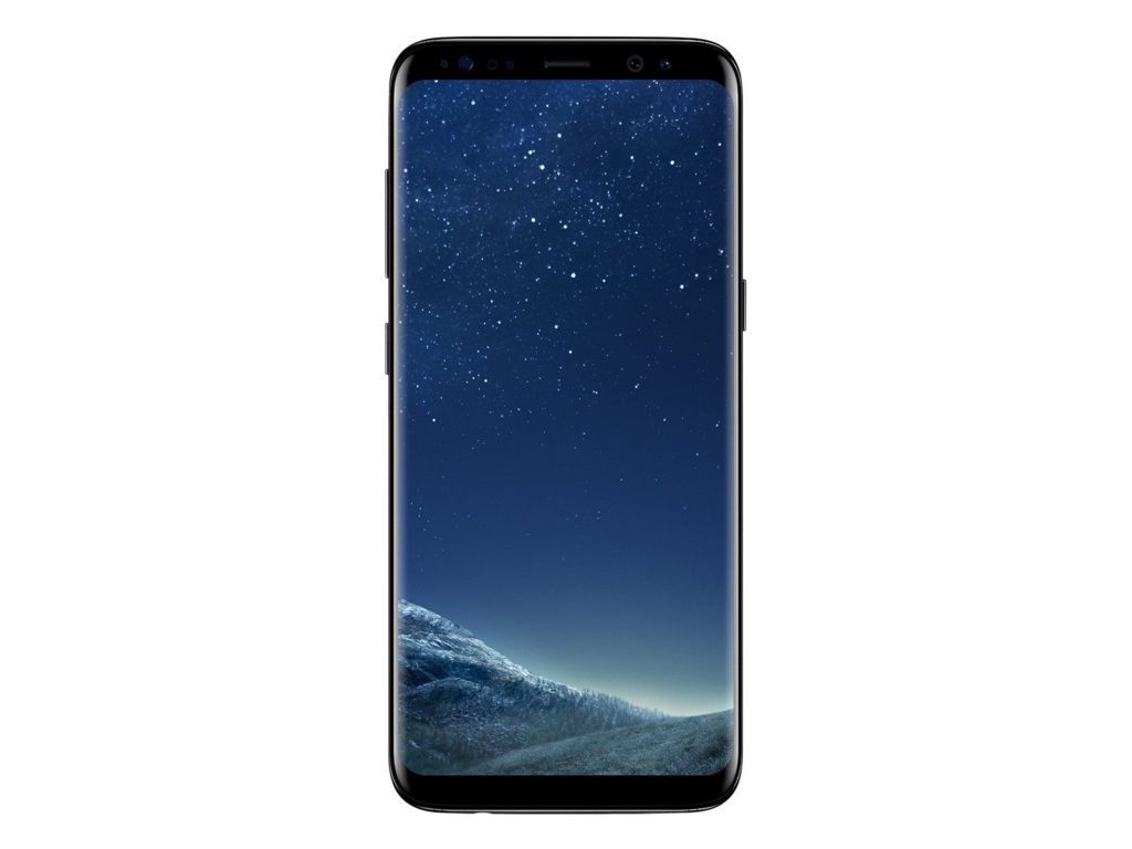
We love the simple, clean look at our favourite gadgets. The bigger the screen, the better it is. It looks sexier and modern, to say the least. When the Samsung Galaxy S8 came out, it was the best-looking smartphone on the market. Their infinity displays just seem years ahead of other phone manufacturers. Came the Galaxy S9, OnePlus 5T, to mentioned some (there are too many models to mention), and phones look the cleanest it has ever been.
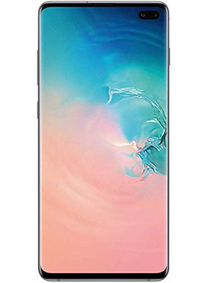
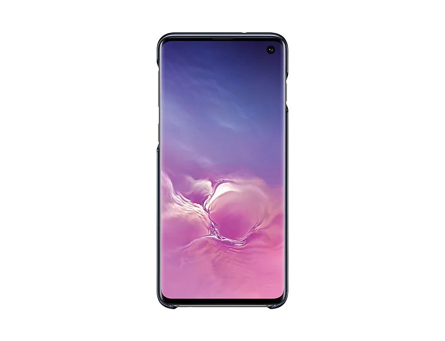
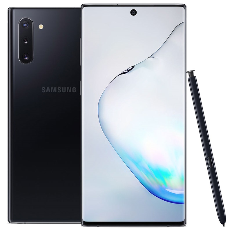
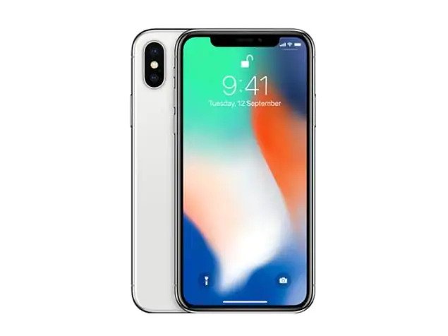
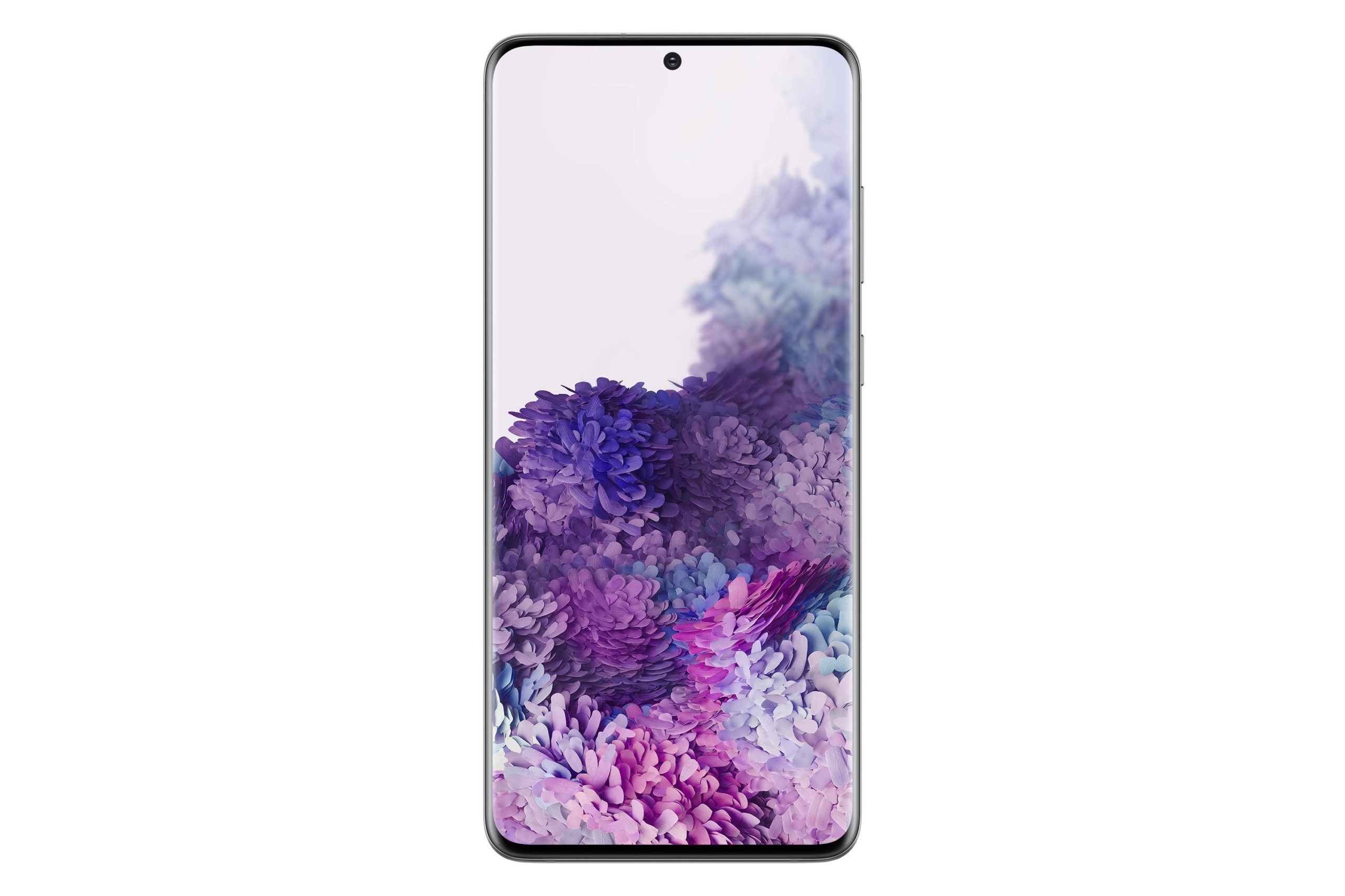
With phones looking the sexiest it has ever been, that’s not enough for the manufacturers. They wanted to shrink it even more. Now comes the almost 100% bezel-less design like the OnePlus 7 Pro, Samsung S10, Samsung Note 10, iPhone X design, and the Samsung S20. And contrary to other reviewer’s warm opinions about the bezel absence, I just think it’s a very daft move and visually disturbing.
With the slightly larger top bezel like the S8, it gives the phone a sense of completeness. The new designs just put a camera hole in the screen, literally. What’s the point of that? What is the point of extending the screen real estate for an extra 3-4mm just for the camera hole to ruin the immersive-ness of your experience? Apparently for the marketing team and other online reviewers thought it makes it more immersive when there’s a hole in your video, said no one ever.
Then there’s the solution by OnePlus 7 Pro. The cleanest phone setup where there’s no camera on the screen but there’s a pop-up camera. The technology of it all is great. The pop-up camera is fast and responsive. Again, I find it to be silly. In my view, it ruins the aesthetics of the phone by having a pop-up to take pictures, or for facial recognition. It also gives a sophisticated, complicated feature, for a clean, and simple look which somehow does not sit well with me. Anyway, it’s just my personal preference.

And on the other side of the smartphone spectrum, Apple too has been on the bezel-less game, although not hardcore at it. The iPhone X and 11 series have the same mid-centred trapezium bezel which again, I don’t get the point. What is does the extra 70’s-looking mafia hairline going to serve? So Apple implemented it for notifications and modes which brings another problem all by itself. Notifications showed on the sides are incomplete. Why not just have a straight, thin, complete bezel so we can see the entire notification icons rather than having to scroll down for everything to be shown?
The bezel trend has gone too far in trying to achieve the maximum screen real estate that it transcends into impracticality. Well past its golden stage, the bezel-game now is about where to hide ear speakers and cameras and it doesn’t show any signs of slowing down. So what do you think of the current state of display technology? Have they gone too far with the gimmicks to the point that consumers are the one suffer the consequences?

