Netflix Brings New Interface For TV

For those who have been using smart TVs and Netflix for some time, you’ll be familiar with the interface already. I have to admit, using an LG smart TV with Netflix isn’t the most elegant idea ever. It’s clunky and thumbnails are stacked on top of one another. Search, recommended, and the categories are just… messy. Well, that’s about to change now with Netflix’s new UI for TVs.
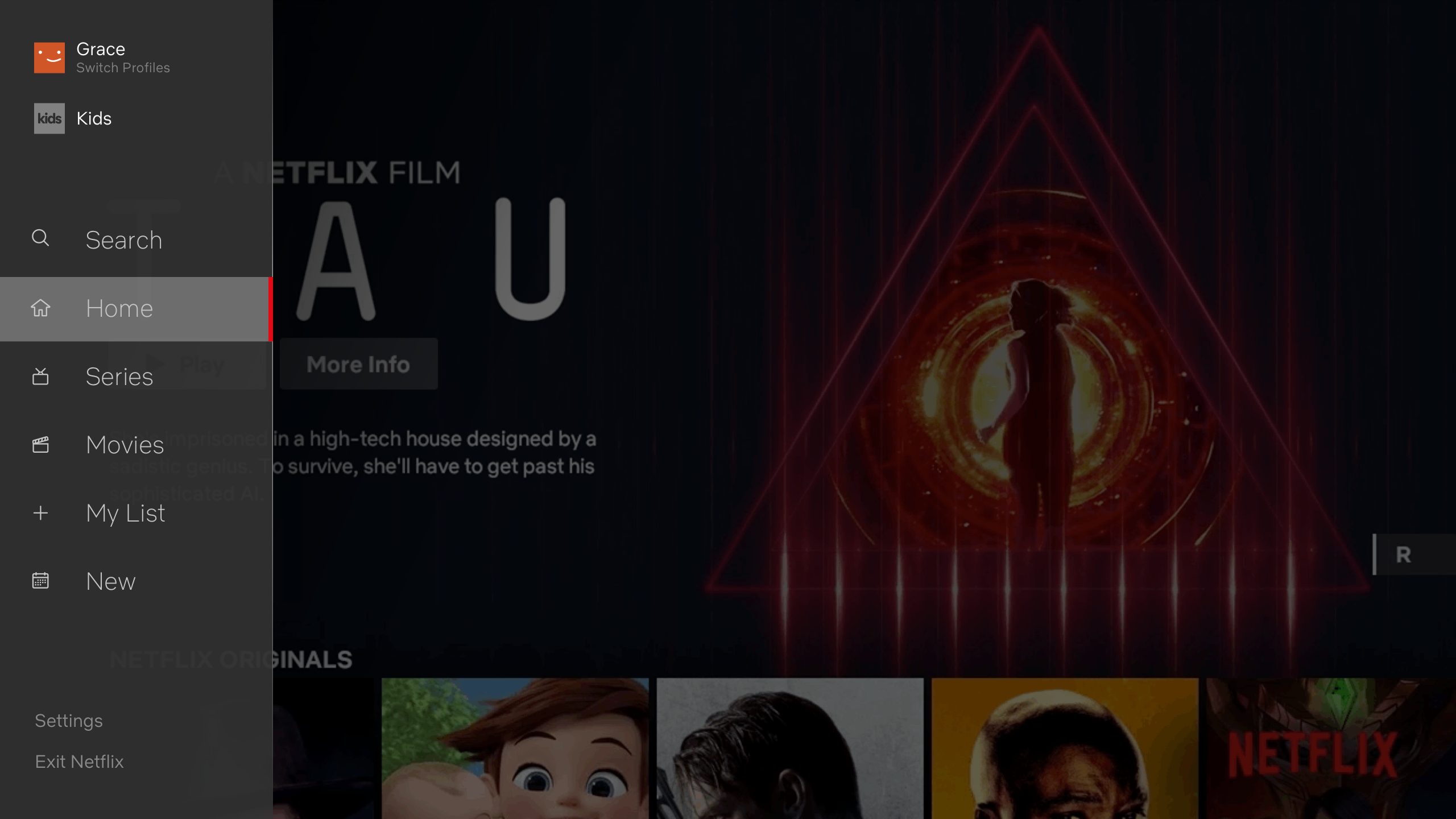
While the main page of the Netflix app remains the same with a preview of highlighted movies are shown, there is a new sidebar menu on the left. That reminds me of the YouTube app that’s found in the LG smart TVs. The new sidebar aggregated the different functions and category selections, hence making it a lot cleaner and more convenient for users.
At the top of the sidebar is where users can change the users as well – which is much more convenient now and everything is just there to be used instantly. All details and functions can be seen and performed via the left sidebar.
As of now, we do not know when this interface will be rolled out to all devices. Netflix says that this new interface will “begin rolling out to members all over the world today”.


1 thought on “Netflix Brings New Interface For TV”
Comments are closed.