Samsung Galaxy S8+ Review: Infinity Display for Everyone
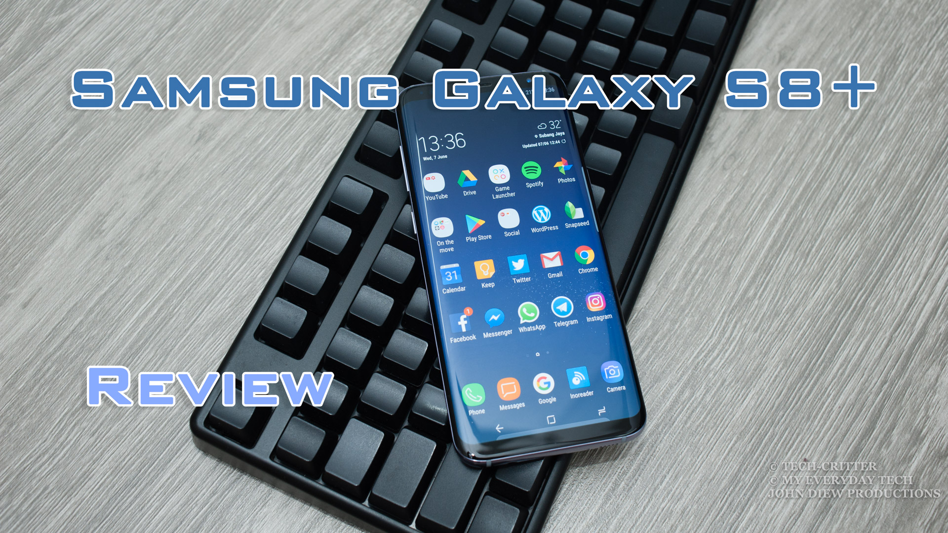
Samsung Galaxy S8+
RM 3699Pros
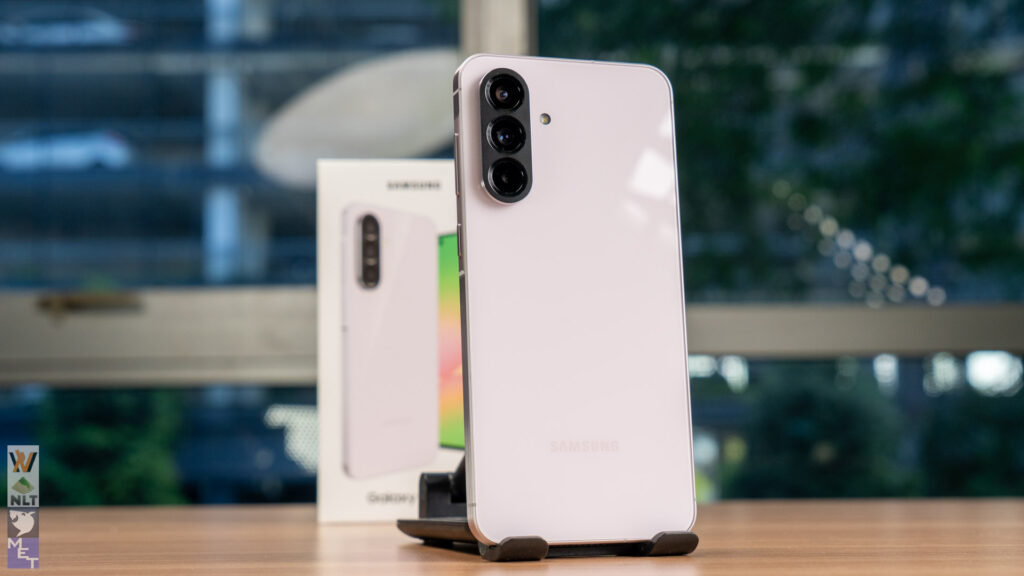
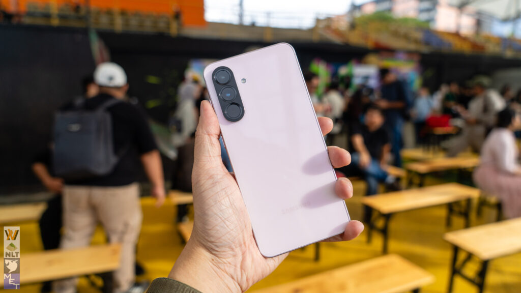
- Excellent build quality
- Excellent accessories package (Micro USB adapter, USB OTG adapter, AKG earphones)
- Excellent 6.2-inch display quality
- Excellent rear camera quality & user experience
- Lightning fast Dual Pixel AF
- Great front camera quality
- Excellent performance
- Great battery life
- Fast charging
Cons
- Awkward fingerprint scanner position
- Half baked Bixby virtual assistant
- Expensive
Build Quality & Design
Build Quality & Design
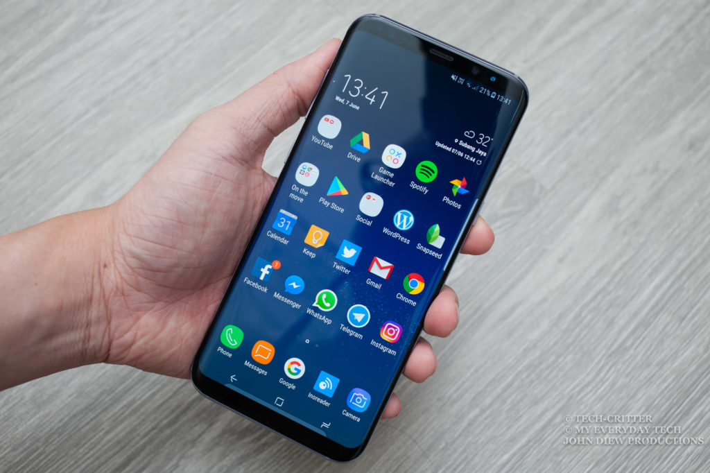
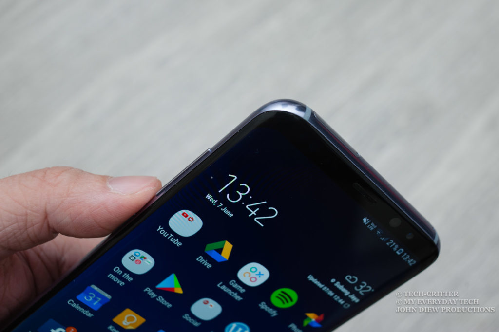
Just look at that massive display, taking up almost 84% of the front glass estate is something you don’t see often. Even the much discussed Xiaomi Mi MIX has 83.6% screen-to-body ratio, no thanks to the massive chin.
What you get is a clean and minimalist front design. Worth mentioning is that Samsung is no longer differentiating the Galaxy S series with Edge version or non-Edge version. What you get is 2 different sizes – S8 with a 5.8-inch display and S8+ with a 6.2-inch display. Both come standard with the signature curved edge display.
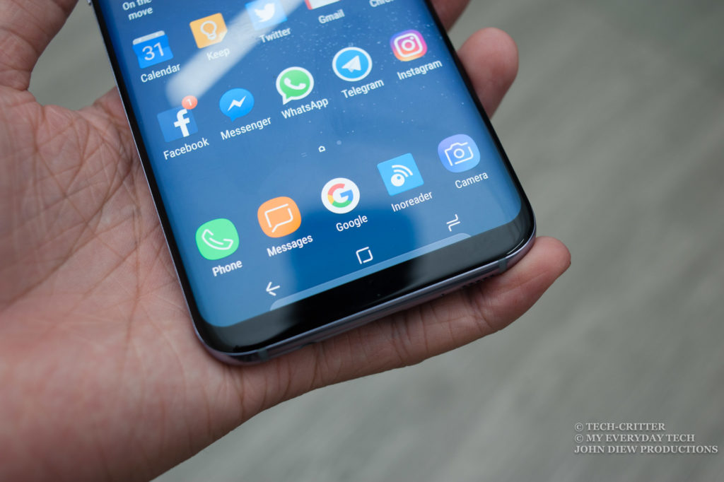
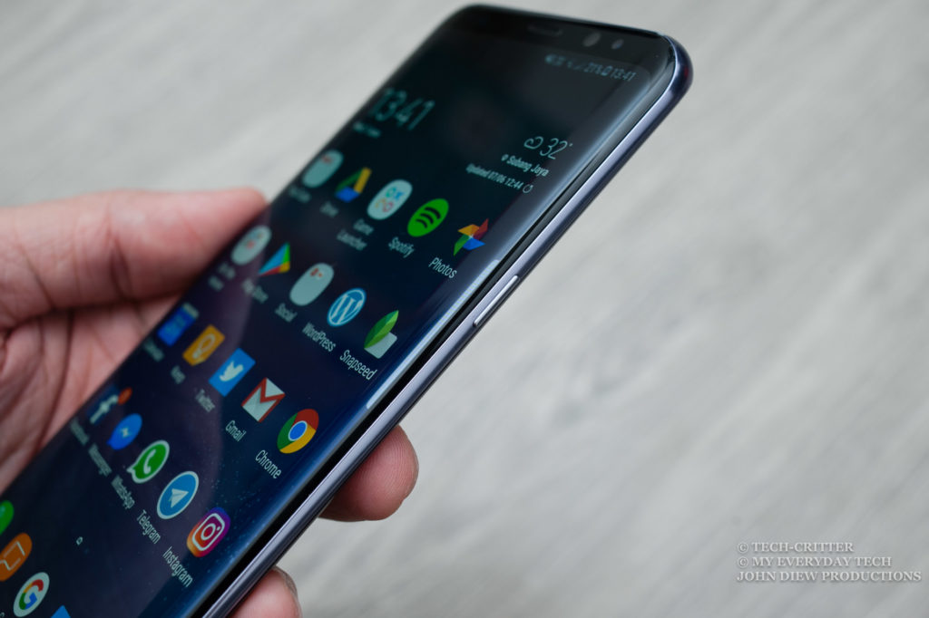
Samsung calls their new display the Infinity Display. The way they implement it is absolutely stunning. With curved edges and rounded corners, it looks absolutely mesmerising as if you’re holding a pure bezel-less phone in your hand.
It is a joy to hold the phone as the metal rim along the outer side of the phone is smoothly polished with no sharp edges.
Of course, there is another concern where it might have very little grip. Therefore one must take extra care in handling the phone to avoid a very expensive accident.
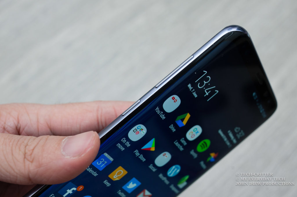
The power button is located on the right side. The position is just right for both index finger or thumb depending on which hand you’re holding the phone.
Then the volume button and a dedicated Bixby button are found on the left side. I totally understand that Samsung is pushing hard on their latest AI assistant Bixby. However, that button placement is just weird and easily triggered. Making things worst is that Samsung does not allow remapping of the button to custom actions. Literally leaving you a button that you might not even use it.
I will talk more about the Bixby function in the latter part of this review.
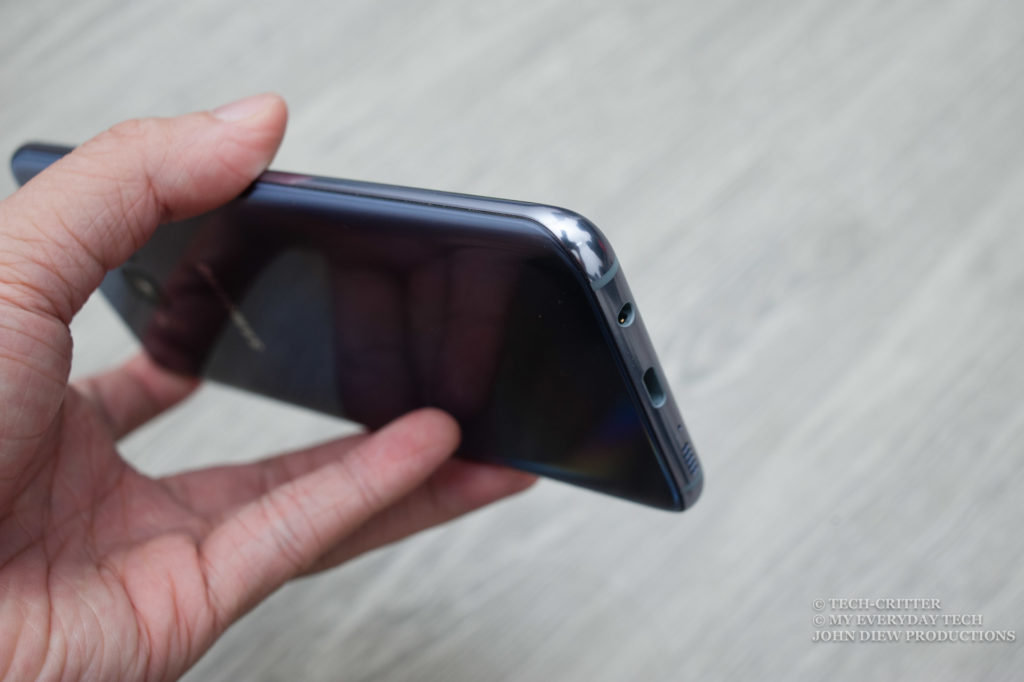
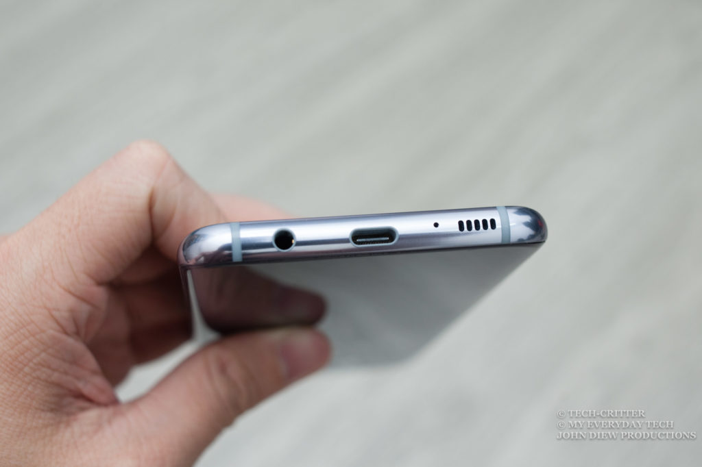
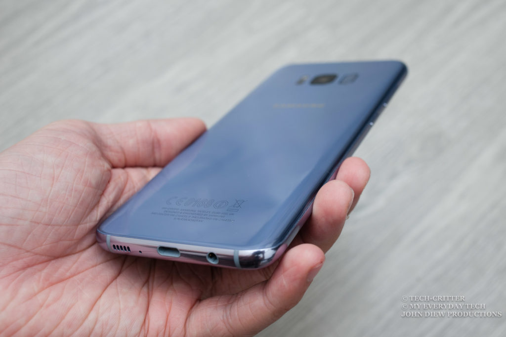
At the bottom is where you’ll find the 3.5mm audio port, USB-C port as speaker.
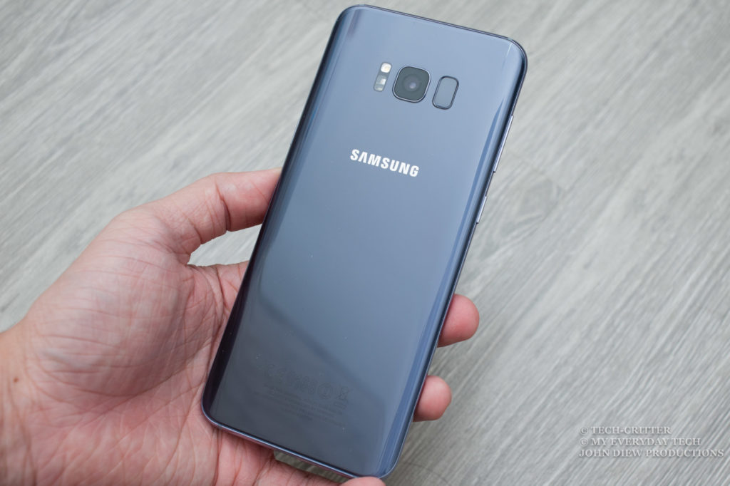
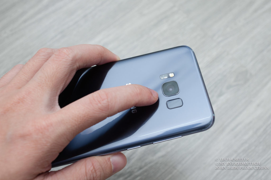
Having most of the front glass taken up by the display, the Samsung’s branding and the signature fingerprint scanner and button has to be repositioned to the back.
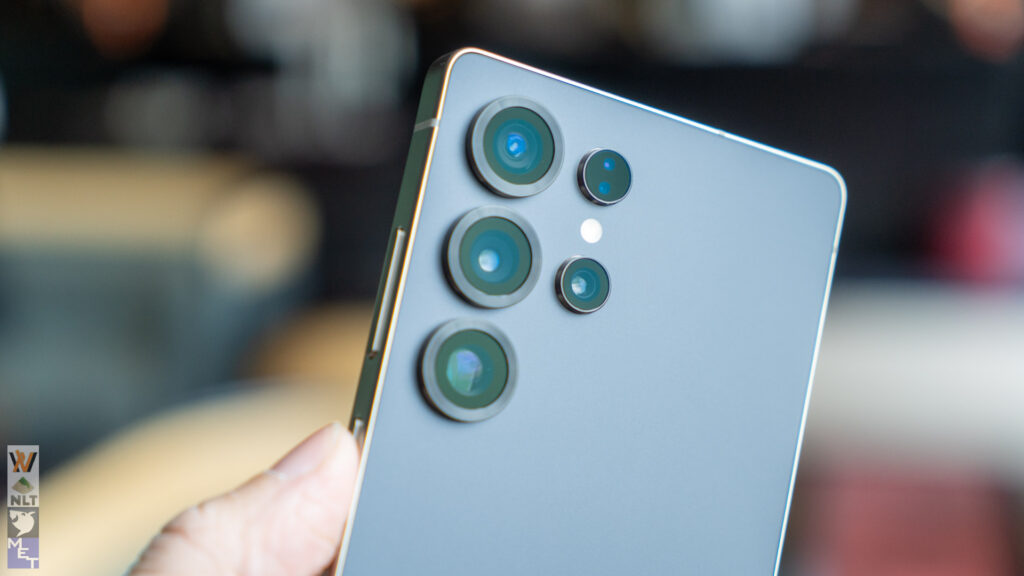
While I personally prefer to have fingerprint scanners at the back of the phone but is this the proper location for it? It is extremely awkward to find for the scanner and what not, putting it so near to the camera lens spells smudges over the lens for that dreamy & foggy photo effect.
While Samsung did provide alternative ways to unlock the phone, namely Iris unlock and face unlock but then they are not as useful as the fingerprint scanner. It is simply because you still need to bring the device and points the camera at your face.
Can you tell this phone has a 6.2-inch display? Thanks to the new display ratio of 18:9 or to be precise 18.5:9, the device is only taller while keeping the width in check. The end result is a phone with a massive display but still, fits in your hands.
Contents




1 thought on “Samsung Galaxy S8+ Review: Infinity Display for Everyone”
Comments are closed.